Kara Heinrich · Personal presentation and document style
Minimal, modern, close to nature.
Sage and nature colors, macro photographs of nature, and light glass you can see through. Kara's style for her own slides, documents and pages.
The idea
Lots of room. One detail to look at.
Clean, clear and minimal, and warm rather than sterile. A macro photograph of nature does the visual work, and light glass sits over it for a little dimension.
Color
Sage leads. Nature fills in.
Warm, earthy and calm: greens first, then soft harbor blue and sand. Light grounds every time. Red is never used.
--sage-100 #E3EBE1--sage-300 #B5C8B6--sage-500 #7F9D87--sage-700 #4F6B59--sage-900 #2F4537- Paper and linen
--paper #FCFAF6 · --linen #F5F2EAThe page. Paper for most sections, linen to set one apart.
- Harbor slate
--slate-500 #6F93B5 · --slate-700 #3E5F80Water and sky. The second color in a chart.
- Sand
--sand-300 #E6D3B8 · --sand-500 #C9A77FWarmth. In charts it marks a change for the worse, in place of red.
- Lavender
--lav-500 #9D97C4 · --lav-700 #6D6894Comparison only: the dashed line for the district.
- District navy
--district #2E487BThe district's own accent. Used once: a short line on the title slide. The district is not green; sage is the personal layer.
- Ink and body
--ink #1F2522 · --body #4A524CInk for headlines and numbers, body for reading text.
- The moving sage
--movingThe gradient for the italic turn in a headline and the main button. It drifts slowly.
- The soft ground
.pastelSage, mist, sand and a breath of lavender, behind a frosted card.
About 70 percent paper and linen, 20 percent sage, 10 percent slate, sand and lavender together: a little touch of color. The district's own colors stay with its logo and seal.
Type
Crisp and modern, one soft turn.
Instrument Sans for headlines, numbers and reading text. Instrument Serif italic for a few words at the end of a headline, at most once per slide.

Logo slotThe circular district logo with the district values around it goes here. Place the file from the district branding kit; never redraw it.
The seal is the district's official mark. Keep it small, on a light ground, in one corner, and never recolor or crop it.
- Headline · Instrument Sans 400, tightWhere we stand today.
- Section title · Instrument Sans 500What we heard this fall
- Big number · Instrument Sans 400, tight00%
- Eyebrow · Instrument Sans 600, tracked, capitalsPart one · Sample
- The turn · Instrument Serif italica few soft words.
- Body · Instrument Sans 400, 17 on 27Short paragraphs, plain words. One idea per slide.
Images
Nature, close enough to see the detail.
Four families: plants, stone and moss, wings, and frost and water. Calm and natural, never too bright. One photograph per slide, a different family from the slide before, never people.

Succulent
The calmest sage. Page openers, frameworks.
succulent
Wing, close
Title slides: light through glass.
wing-detail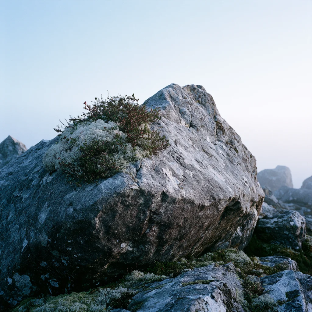
Mossy boulder
Steady ground. Section openers.
mossy-boulder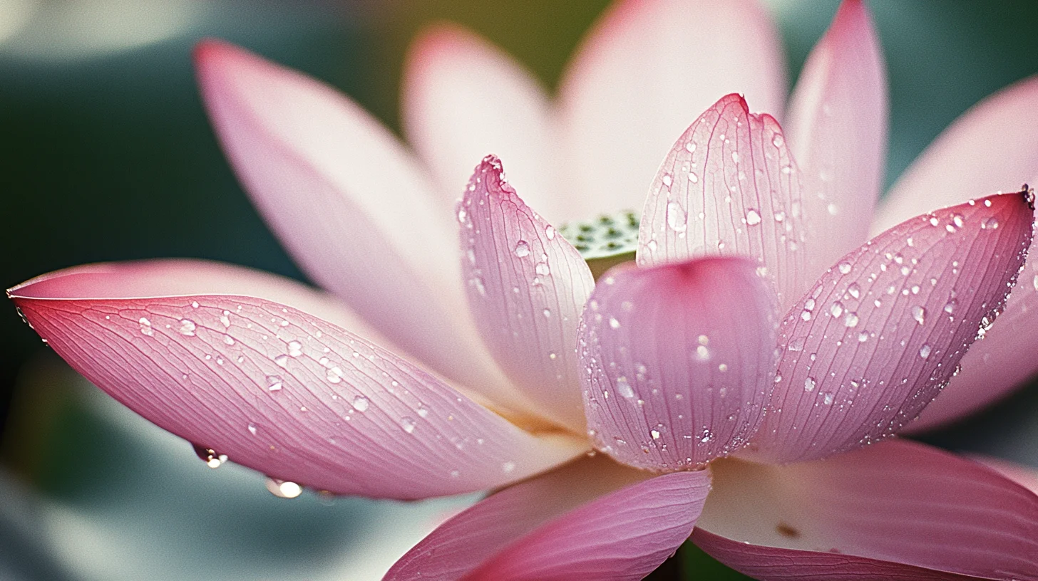
Lotus
Growth and beginnings: a new plan or year.
lotus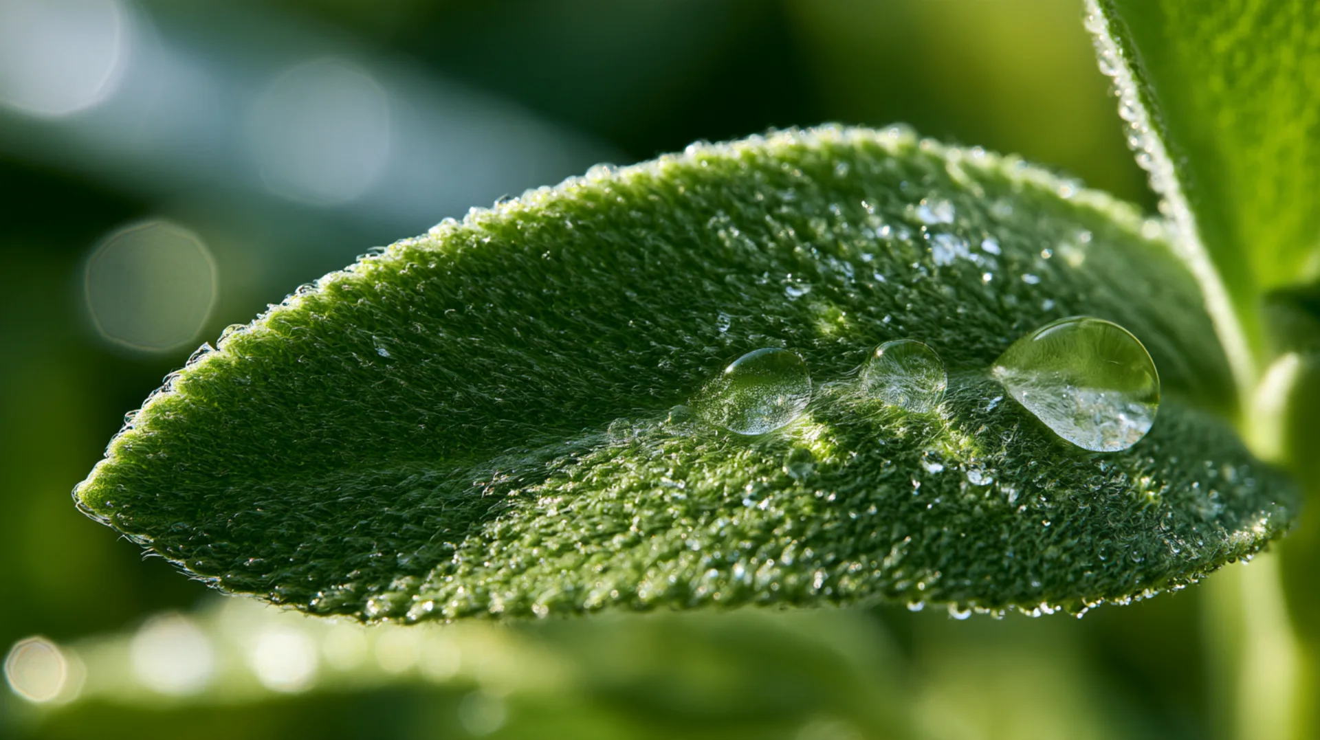
Sage leaf
One big number or one statement.
sage-dew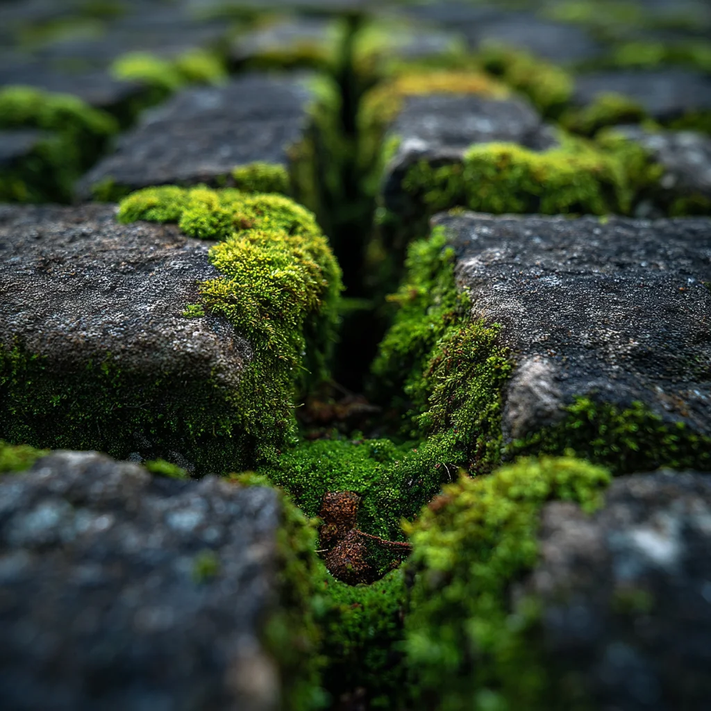
Moss in stone
A faint wash behind a chart, or a tall panel.
moss-cracks
Frost
The boldest blue. Small panels only.
frost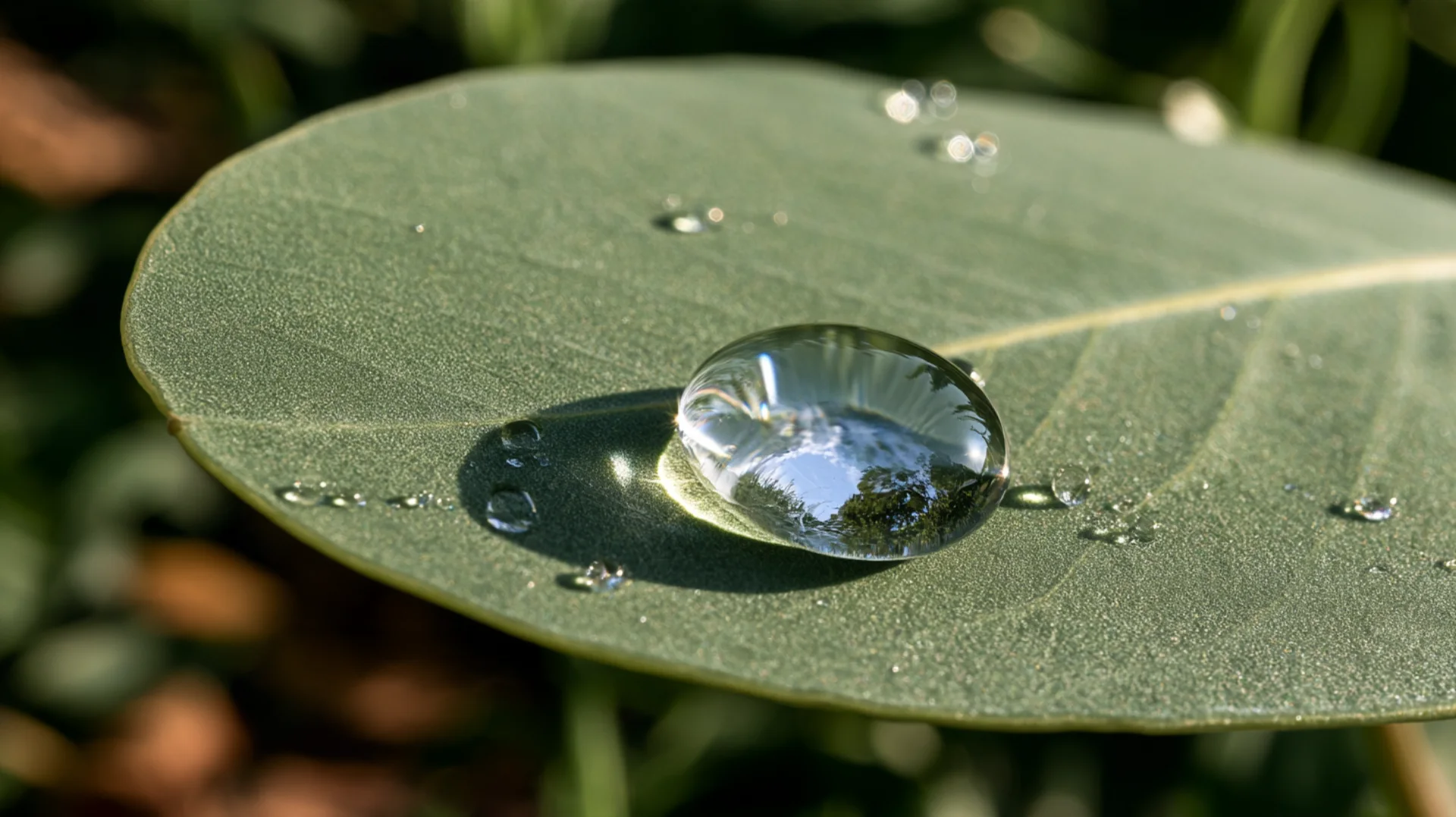
Eucalyptus drop
A quote, or a moment of reflection.
eucalyptus-drop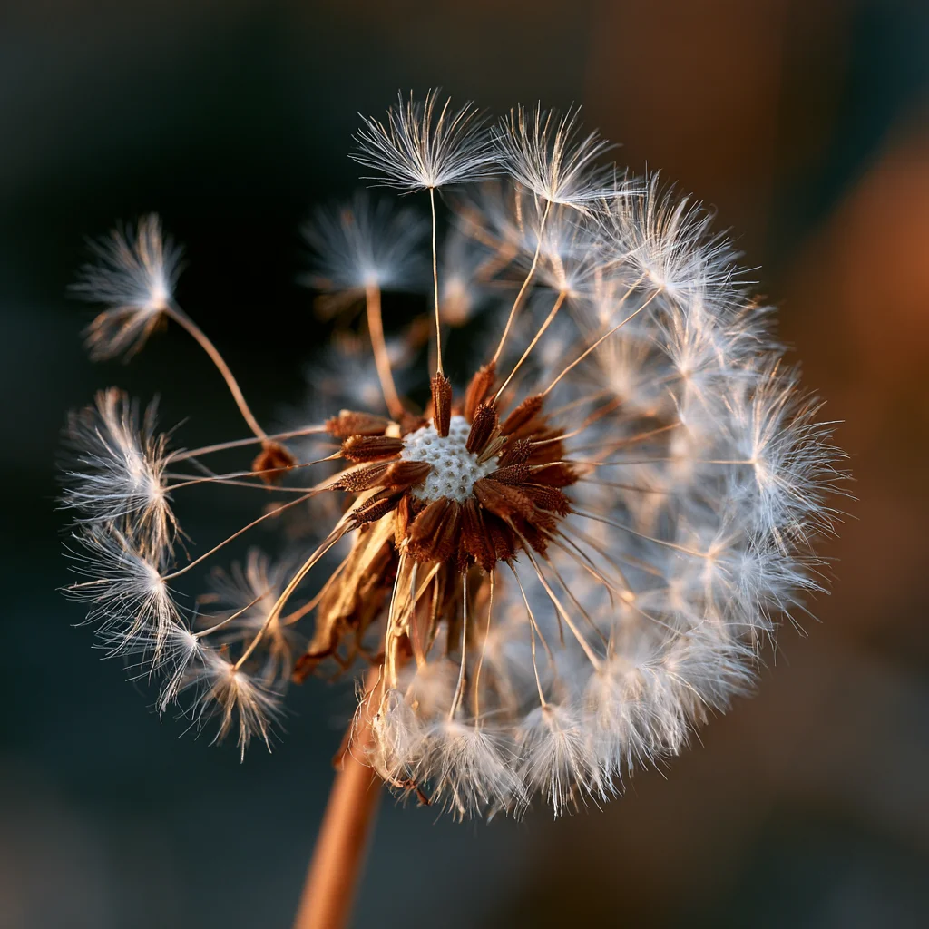
Dandelion
Ideas going out: next steps, sharing.
dandelion
Two wings
A photo panel beside a title.
wings-pair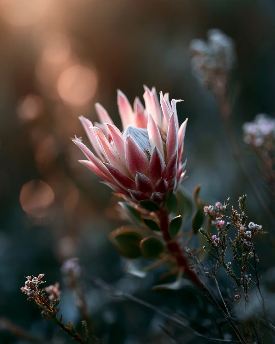
Protea
A warm accent: thanks, recognition.
protea
Backlit wing
The close: thank you, questions.
wing-backlit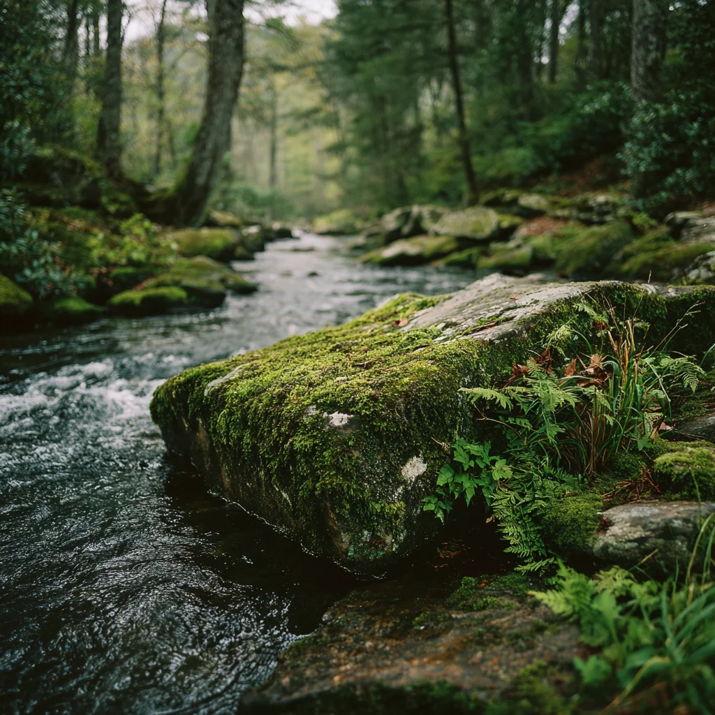
Moss by the stream
A calm overview, or a long view of the year.
mossstream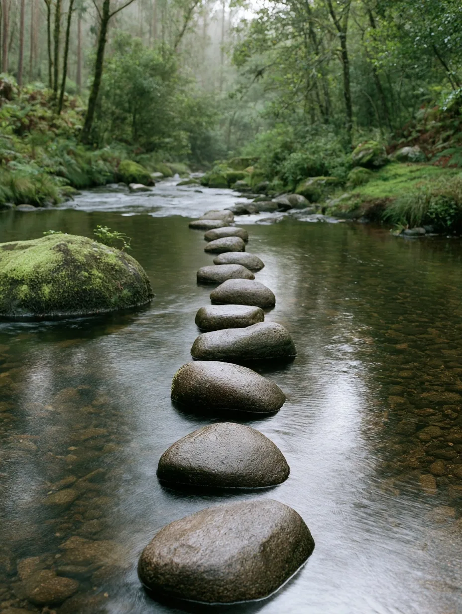
Stepping stones
A path or a sequence: steps, phases, a timeline.
stones
Single wing
A quiet photo panel, or a slide about clarity.
wing-single-a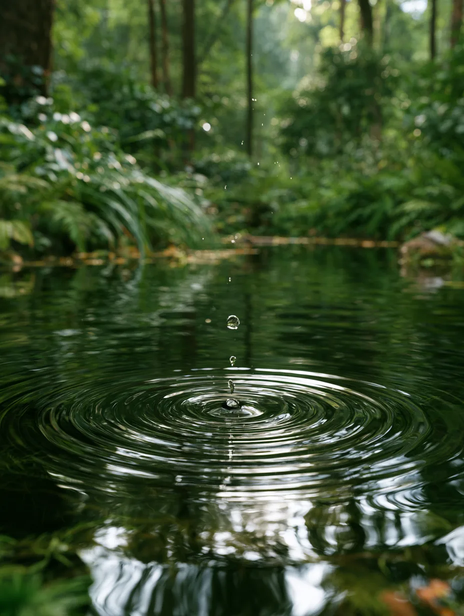
Ripple
Impact and what spreads from one change.
ripple
Images: generated nature studies.
Frost · the default
White frosted glass for words and numbers.
Most cards, panels and slides. Lightly frosted, so the photograph stays defined behind it, with dark ink that stays crisp.
background: linear-gradient(135deg, rgba(255,253,248,.82), rgba(255,253,248,.68)); border: 1px solid rgba(255,255,255,.9); border-radius: 18px; backdrop-filter: blur(9px) saturate(1.25); box-shadow: 0 30px 80px rgba(40,60,50,.16), inset 0 1px 0 #fff;
Clear glass · small, on a photo
Tinted glass for a short list.
Only on a photograph panel, with white words: an agenda, a label. The tint runs sage to lavender to sand, pulled from the photographs.
background: linear-gradient(135deg, rgba(118,158,146,.40), rgba(150,142,196,.26), rgba(206,170,140,.24)); border: 1px solid rgba(255,255,255,.34); border-radius: 18px; backdrop-filter: blur(10px) saturate(1.3);
The pieces
Small parts, used the same way every time.
- Topic one
- Topic two
- Topic three
Charts
When a slide needs a chart, keep it simple.
One chart on a white card, sage bars, a dashed lavender line to compare against, and the source underneath. Every number here is a sample.
A simple comparison SampleOne bar for each item. The dashed line is the average.
Source: name the report and the year here.
A change over time SampleThe latest point is marked.
Source: name the report and the year here.
- One message per chart.Say it in the title. The chart proves it.
- Bars and lines, with percentages.Show the value on every bar. Round ends, pale tracks, light grid lines. No pie charts, no 3D.
- No red, ever.Sand marks a change for the worse. Sage carries everything else.
Do and don't
Minimal, with a little interest.
Flat is clean, and a little depth makes it alive. Leave room. Let one photograph and one idea carry each slide, with three or four things on it at most.
- Keep every slide and page light: paper, linen, frosted glass.
- Use one macro nature photograph per slide, quiet behind the words.
- Put words and numbers on frosted glass or paper cards.
- Lead with sage; add slate, sand and lavender sparingly.
- Leave wide margins and few elements: three or four per slide.
- Name the source under any number, and tag placeholders as samples.
- Keep the district seal small, in one corner.
- Dark slides or dark mode.
- Red, neon or bright saturated color.
- People, students, faces or hands in any image.
- Cartoon, clip art, icons as decoration, or a glossy AI look.
- Pie charts.
- Ornate or decorative type, heavy borders, busy layouts.
- Images that are too bright, angelic, cartoonish or retro.
- More than one italic turn in a headline, or text on a busy part of a photo.
- Redraw, recolor or stretch the district logo or seal.
The style at work
Light, calm and clear, every time.
The slides show the look at work: a title, a section, one big number, a chart, two columns, a quote and a close.